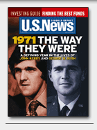
See anything biased about the image below? (It’s from an early May edition of US News and World Report.) Think about it a minute, and see if you can find 3 points of possible bias.

I fancy myself somewhat media savvy, and I did notice that this magazine cover presented a very slanted message: note the draft-dodging, AWOL, appointed President, in uniform. Compare that to the photo of John Kerry, clad in a suit, on the left (oh! I just noticed that one!). I told myself that, yes, it’s biased, but, and this is where I give them credit, it’s true. In 1971, Kerry was already out of the service, and Bush was nominally serving his country.
So, let’s recap the points of bias:
* veteran Kerry, show in in suit, vs. AWOL Bush, shown in uniform.
* liberal Kerry, on the left; conservative Bush, on the right
And finally, courtesy of Slapnose, comes the observation that Kerry is decked out in a nice shade of commie red!
If you agree, please let the magazine know your feelings. Every little bit helps!

Also notice – Kerry is looking away and Bush is looking straight ahead – that is Kerry looks “shifty” and Bush is “looking you in the eye”
Well, Kerry is “shifty.” Listen to him for 10 minutes, and you’ll have no idea what his position is.
I’ve never had trouble figuring out Kerry’s positions. They simply lack the sledghammer “moral clarity” (er, oversimplified) of Bush’s thems-just-evil declamations.
The color choice is key in this image. Red is the color of danger. For a different story they would have put Saddam Hussein or Kim Jong Il on the left.
Misleading — the colors have always (AFAIK) been blue = democrat, red = republican. Google for “election map” (or “cnn election map” — CNN has many good ones). For example, http://www.sptimes.com/election2000/map.shtml or http://www.usnews.com/usnews/news/election/map.htm
Why reverse it? I don’t know. Tring to confuse readers?